
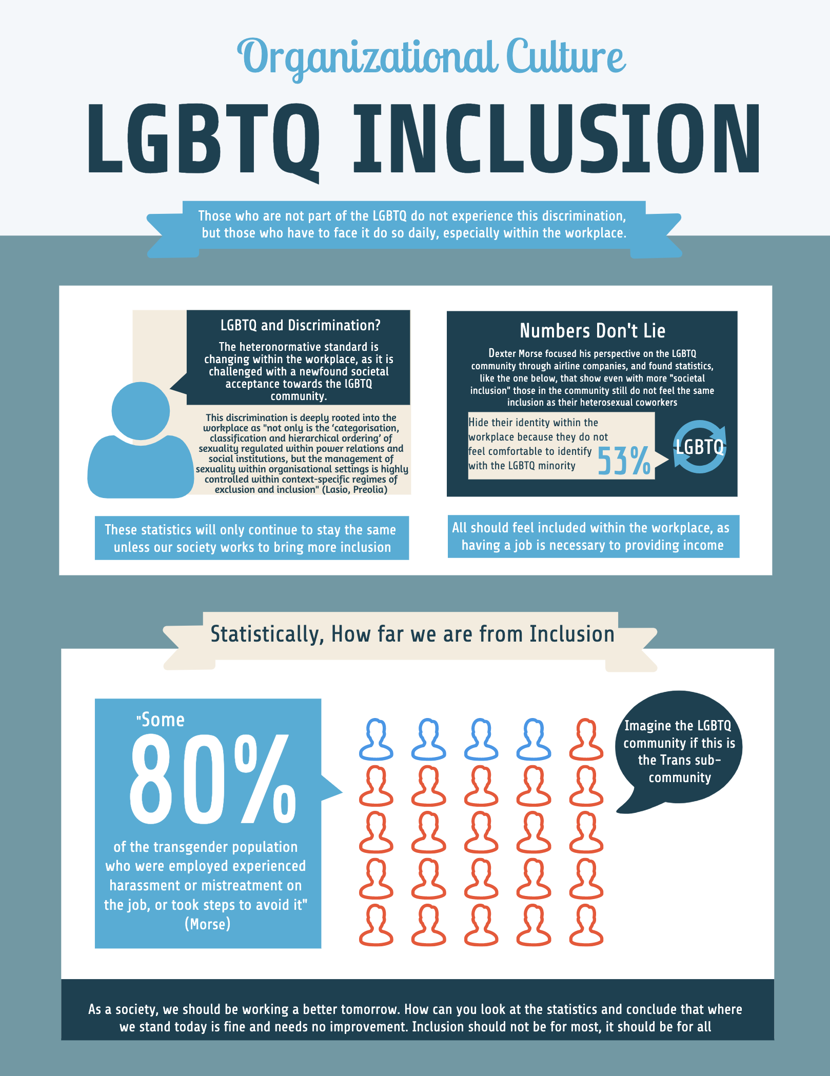
This social media infographic would ultimately catch the attention of those who are not educated on the discrimination faced within the workplace for those who are part of the LGBTQ community. I would want the post to primarily be showing the statistics in a visual format that would captivate an audience of people. These posts could be shared around, spread through social media, as more become aware of the predicament our society is in. The primary purpose is to educate those who are not too familiar with this said discrimination, either they do not see it or do not fall victim to it.
I really like your infographic, I think you did a great job with it! It is very organized and informative. The facts that you add could be eye opening for those who are not educated on this subject. Your infographic looks like one that could be shown in classrooms, the workplace, or really anywhere because of the information that is being presented. However, I like that you centered it around the workplace. This infographic could be a great call to action for many different places because it shows how as a society, we must change and become more accepting.l I think you did a great job!!
I think you did a very good job at creating an informative and short way to catch the readers attention. An infographic is the perfect way to catch the eye of a passerby-er and draw them in. I think you did a good job at making the statistic big, so that way it is the first thing people see and are curious as to what is going on. I think your titles are great and to the point, creating a call to action. The infographic is a great way to reach a mass amount of people to quickly get your point across and known. The only thing I would say is make the text bigger if you can but you did a great job!
This infographic is very eye-catching especially for a workplace environment. I think the layout and hierarchy you used does a really great job of bringing the audience towards the most important facts making them want to stop and learn from it. The only suggestion I have is making sure that the text is centered in the boxes so that it is not overlapping with the edges, that will make it easier to read the information but overall I really like your execution and think it works well with your concept and audience.