For my unit 3 project, I have decided to focus on men’s mental health and raise more awareness on the stigmas surrounding the issue, such as “men are not allowed to show emotion”, “men should not cry”, etc. To teach more about this, I think that the target audience is between teenagers to young adults, so high school and college male students. The best way to reach this group, in a professional manner, would be through an educational infographic sent by the place of education. By sending out a campus wide email, it ensure that the pertinent information is easily accessible, concise, and available to a large portion of the target demographic.
I am aware that an issue with sending a school wide email is that many students tend to, either ignore their emails or briefly skim them. To counteract the proclivity to glance at the emails, I would make it as brief as possible, yet maintain a good amount of necessary information in easy-to-read sections. And for the students who neglect to read the email at all, the infographic could be printed out in poster format and posted to various doors in different halls. Therefore, I will try and make the infographic as visually pleasing as possible.
The reason I think that this information for this target audience should come from the schools, is to solidify that men have resources to help deal with their mental health issues that are offered at most colleges/ universities/ high schools. At the end of the memo, I would remind the students that there are always people willing to help, and in Syracuse’s case, just a phone call away or right across campus at the Barnes Center.
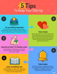
I personally really like this infographic in reference to my research because I could try to make mine come across as a sort of step by step to getting help and to counteract the stigma behind men’s mental health. I also want to include statistics on my infographic so I am still looking around at different examples. With this particular one, I enjoyed that it is very simple and easy to understand but that also just makes it a little boring, so I want to make mine more engaging.
Know the 3 most important factors in real estate? Location, location, location.
Well, for writing, it’s audience.
Take a look at the rubric for your Unit 3 project, and you’ll see this come up again and again–note how many of these items hinge on textual features that are appropriate to the audience. That’s why you need to have a very clear picture of who your audience is, so that you can better assess what they will need and expect from you, so that you can deliver.
Presenting your research in an audience-appropriate fashion is the critical to the success of your communication. You might have terrific information and important new ideas to share, but if you can’t make them land with your audience, there’s little point in you writing in the first place.
That’s why we’ve spent the last couple of weeks looking at texts that weren’t scholarly articles or straightforward academic-style essays. Those genres work really well for certain audiences and purposes–to communicate cutting-edge new ideas to other people with some background knowledge/expertise in the field–but they don’t work well for everybody all the time. We depend upon other genres to communicate in other situations.
And that’s why I’ve asked you to get pretty specific in setting forth the rhetorical situation that you’ve conjured for this text you’re creating. In order to understand and evaluate your work, your readers need to know just who you’re aiming to reach and under what circumstances. That’s why I asked you to include an explanatory note with your draft. You’ll do the same with your final revised version.
It’s worth reviewing some of the myriad ways in which audience matters
Decisions about audience and purpose are intrinsically connected–it wouldn’t make sense to provide general knowledge background to people who are already experts, nor would it make sense to lobby entry-level workers for policy change (since they’re not the ones who make those decisions). Your audience and your objective need to be tightly and logically connected.
Your audience dictates various writing choices–how long will you be likely to have your readers’ attention? how much specialized jargon can you use? how much background information will you need to provide? what’s an effective level of detail? what kinds of examples will they be most interested in? what source information will your readers expect to have for their own follow-up? what kind of relationship will you seek to establish with them?
Knowing your audience lets you shape your text to be functional for them–in terms of level of formality, voice, use of graphics/media, visual organization of the text, incorporation of external links, etc.
I encourage you to reflect on these choices as you’re completing the revision exercise this weekend and as you’re revising your final project for submission on Wednesday, 8/25. Please note that due date–the final project is NOT due on the final day of the summer term, in part because you have some other work to complete afterward (your course reflection and any outstanding assignments you might have, AND in part because I know this is a transitional period for many of you who are heading into fall classes and/or other responsibilities. This way you’ll have one big thing cleared off your plate and will be that much closer to moving on.
If you have any questions as you’re working on your revisions, please don’t hesitate to email me. I’m happy to correspond that way or to chat by phone/Zoom. It’s been nice to see some of your faces (albeit on a screen) over the last few weeks. I’ll gladly arrange a time to chat with any of you who would like.
Hope you can all find some time to enjoy this last week of summer. To those of you in NY/New England, best wishes over the next 36 hours–I hope Hurricane Henri decides to shift course and pass offshore. Stay safe.
My project will be directed at young people entering the workforce. The goal is to educate future employees on how to proactively identify and address issues of sexism and sexual assault in the work setting.
The form of my project will be an infographic. The example I located explained how to stop the spread of germs (specifically respiratory diseases like COVID). I like that infographic I located incorporated a combination texts with visual elements. This style can be very informative yet can be an easy and engaging read. However, this infographic has less text/facts than I would like to include. The content within this source has the ability to show more visually with pictures than my topic will. I do like the conciseness and organizational components of this graphic because it effectively gets the main points across. I also thought the color scheme worked well. I enjoy making infographics and am excited to see how mine turns out.
In this type of writing, its most influential and distinctive features would be stylized words that stand out over others. In this example, it would be, “Be An Ali”. The “A” in “ali” forms part of a wheelchair graphic. The poster demonstrates how to support those with disabilities and succumb to ableism and judgment. While stylized words look nice, the effective ones usually have a double meaning like this behind them. They are incorporated in a way that makes viewers remember the words and the special effects that go with them. In this specific example, this poster is linked for people to print out and put up as flyers, being pretty spot on when it comes to my desired genre.
This example works well because it is bold and clear and includes subtexts that encircle “Be An Ali”. To grab readers’ attention, there first needs to be the main subject displayed. When it comes to my topic, intersectionality and bias could get tricky since there are two. I am afraid readers won’t know where to look, become overwhelmed, and move on with their day, not retaining any information. So, my challenge will be to incorporate the two together and somehow display their co-existing features. Intersectionality and bias overlapped with my research, which I verbalized, which I now need to demonstrate graphically.
What I like about this poster the most is its simplicity. There is one main focus here, and subtext helps support it. Light graphics are an excellent addition, and I bet viewers would remember the poster more due to these. However, I do not believe this example is 100% successful. The simplicity is a little overdone, with words not very organized, just surrounding the poster’s title. Yes, they are categorized but with mini headings. For my poster, especially after viewing this one, I want to set up my words in a very strategic way. I am not sure yet what this entails, but I know graphics will be incorporated to tell a straightforward story to the viewer. Not only do I want this to be straightforward, but meaningful and impactful.
I also want certain subjects of text to bounce off of each other and connect. In this example, the text is written the same way bullet points would be. I want my bodies of text to co-exist with each other, presenting a cohesive overall body of text. There are a lot of design strategies that I have been brainstorming that I plan to experiment with. Being a design major myself, one of the most important things that I have learned and have continuously seen through successful design is that graphics have the power to spread a message sometimes more than words. With this graphic and text combination, I believe my poster could be compelling. I do not want to lose sight of one over the other but simultaneously incorporate the two to enhance each other.
I’ve decided to share an example of an online magazine article from the Harvard Business Review https://hbr.org/2021/08/how-to-work-with-someone-who-creates-unnecessary-conflict?ab=hero-main-text . What’s distinctive about this type of writing is that it offers advice and it’s written in the first person. So, although this piece is meant for anyone who works in or owns a business, and is published in a business magazine, the author makes it friendly and as though she were having a conversation with a colleague. She also breaks down her advice into chunks with explanatory headers. The author quotes experts, as well as the experiences of those in the workplace, and includes links to research and other relevant articles. I appreciate the conversational tone and, as I too plan on doing, the links to other articles. These links help to provide evidence to back up her statements without changing the flavor of the article into something more scholarly. This made me realize that what I’ve written for my project so far might need to be tweaked a little to sound more advisory and less explanatory. I also like how the author used several case studies to demonstrate the issue being discussed. I think I may lean on some examples of situations I’ve encountered as a union rep. as my own case studies. In the sample article, there are step-by-step instructions on how to tackle the stated problem. Later, the author offers best practices that are being used successfully by other companies. I probably won’t be able to offer step-by-step instructions, but I will be able to suggest what can help create the cultural change I want to see in organizations.
The Employment and Discrimination Law Blog on Thompson Reuters is a good model for the genre I will be writing in for my AI in HR advocacy blog. The most recent blog post, “Managing cases of Long COVID: The Next Unknown,” is written in a peer-to-peer style that is conversational, easy to read, and similar to the tone I will aim for when I produce my text. I will try to put a little bit more energy into my writing because my goal is not only to share information about AI in HR but also to inspire people to join me in spreading awareness. The co-authors embed links to supporting material, which is how I plan to incorporate some of my research. I especially like that they end with a section of practical things readers can do to get involved, and I like how they use bullets and bold text to draw attention to the action items.
Some things that might have made this post more engaging for me would be a call out of an important quote or statistic, or possibly a relevant graphic such as an image of the cover of one of the reports they reference. Another thing this blog is missing is a way to build a community of advocates, which will be an important part of my blog. However, the sample blog does involve contributing writers, which is one of the ways I would grow content over time. And finally, this example doesn’t have any site navigation, so I will do some work on the structure of my site, creating a navigation and tags so readers with different interests (employees, employers, etc.) will be able to find content that is relevant.
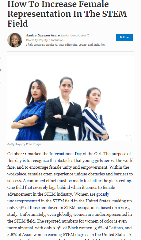
As a part of one of her many contributions to Forbes Magazine, Janice Gassam Asare, a strategic provider for diversity, equity, and inclusion, published “How to Increase Female Representation in The STEM Field”. In this piece, Asare does a brilliant job at luring the reader into wanting to understand more about a select number of barriers that women face when pursuing careers in STEM. Her magazine article provided a unique structure that made her piece so successful. Her title begins by stating the intent of the writing, which is to provide insight into how to increase female representation. In other words, provide the reader a solution to the problem. After the title, the author gives her reasoning as to why she wrote the article at that current time. I thought this was useful because instead of just going straight into the problem and then presenting the solution, Asare stated that October 11 was the International Day of the Girl. She then went into the meaning of the day, a day to recognize all of the obstacles that young girls encounter. Asare then points out to the reader that the STEM industry, instead of breaking down barriers, has numerous barriers that make it difficult for women. Women have to exceed expectations to have a chance to enter the field. Asare makes her writing stand out because she seamlessly provides statistics, to where it does not seem like she is trying to force anything. I think this is a sign of a great writer because, as we all know from experience, it is sometimes difficult to blend thoughts with statistics or evidence.
After providing some background information on the problem, Asare provides the problems to the subject at hand. She writes them out in a list, where each issue is in bold for the reader to easily notice if they are skimming. I think that this is unique and a great way to get the reader’s attention. Personally, if I am reading an article for fun and there are no bold headers or anything to grab my attention, I get lost and find it difficult to concentrate. Bold headings always seem to draw me back into the article, so I appreciate the author’s use of bold letters in this case. Along with the problem sections, solutions are provided in the same location. Often, writers split problems and solutions into two sections, so I thought this was unique.
What stands out to me most about reading this article is purely the format and the writing style that Asare uses. She uses more of an assertive tone with the reader but still manages to convey her message. It is not conversational as many other magazines are, as they often refer to the readers and themselves as we or us, rather, she addresses the issue as this issue. I thought that was interesting just because usually, writers try to ask: how can we fix this?
Overall, I liked the format of this article. I believe that Asare played to her strengths and focused on things that she was passionate about herself. She was confident about the subject most likely due to her experience with the issue at hand, being a strategic provider for diversity, equity, and inclusion. Her tone helped illustrate this, as it was confident and efficiently conveyed the message. There are things that we can control to help women break into STEM-related careers. Her use of bold letters also stood out to me. Also, being the short article that it was, only a page or page and a half in length, it conveyed the message well and helped illustrate that you do not have to overcrowd your paper with statistics to be successful at giving your point.
There were some things that I found might help create my article, others not so much. Although I found it interesting that she posed problems and solutions in the same paragraph, I did not like this format. I would rather keep the two separate, as I believe that is a cleaner, more easily understood format.
I did, however, like how she posed a solution in her title. I think that I will use that for my project. I also appreciated how she used bold letters for each of her sections that were on a new subject/solution, so I plan on using bold headings for my project as well. Her use of lists made it simple to scan through, so I plan on using a list for the reasons why the underrepresentation of women in STEM exists. I think this will make it easier for the reader and for me to plan through my writing.
Summary of article: Tone- Assertive, trying to illustrate point. Length- Short, around a page. Graphics- One image of women in suits before writing in article begins. Style & Syntax- More descriptive about the issue at hand and solution than anything. Somewhat short, easily read sentences due to length and word choice (simple wording, no big words). Level of detail- Does not really dive into the subject deep, just gives the reader a glance into the subject. Formality- Not as formal as a scholarly article, but not conversational. It stands somewhere in the middle, but shifting more towards conversational/informal in my opinion.
I look forward to using this article to create my writing piece, as I feel I learned a lot from just analyzing this short article.
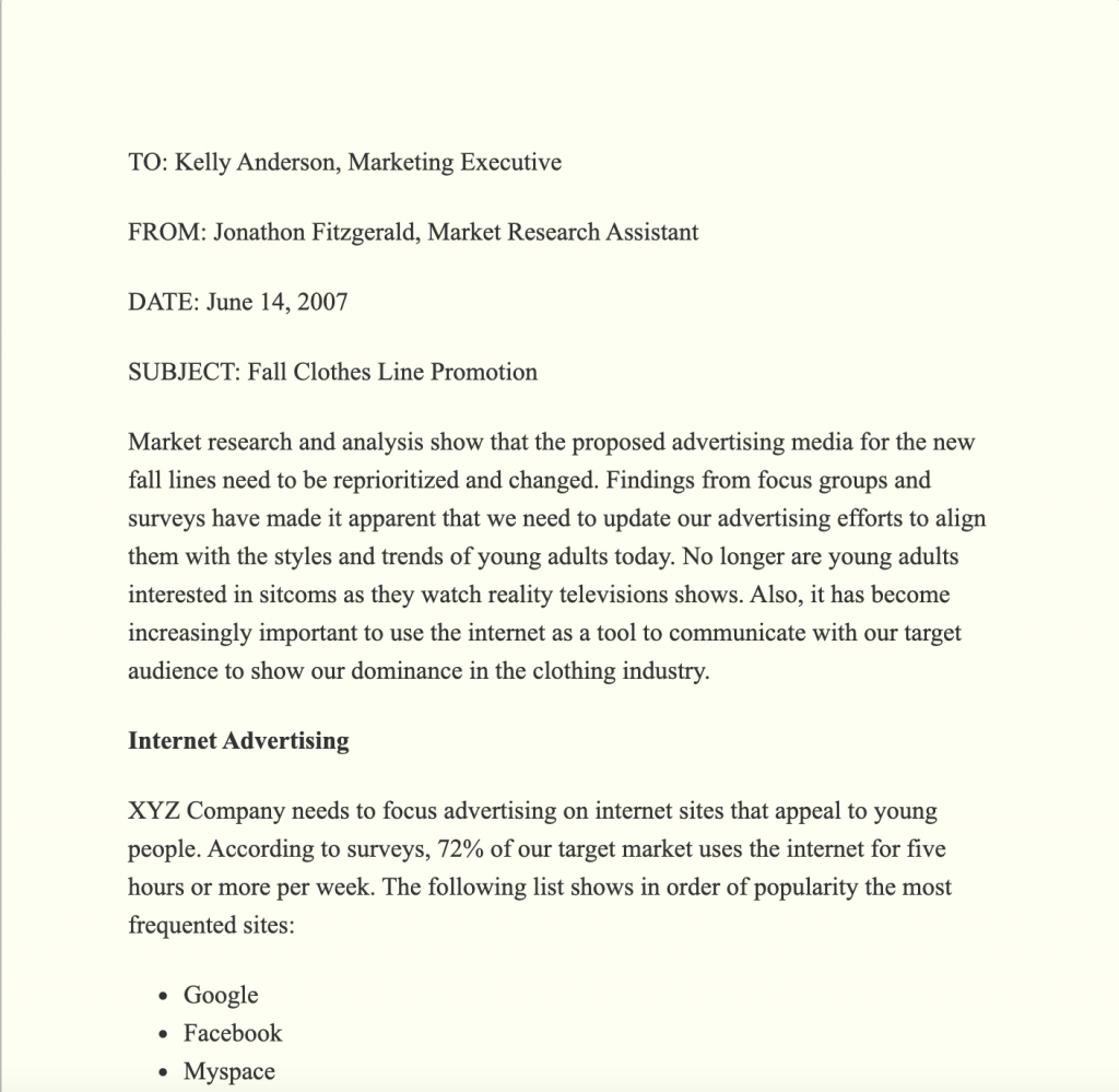
This type of writing gets to the point quickly compared to a book or an article. It categorizes the information in ways that allow the reader to navigate the piece easily and understand information is trying to be passed on to them in a timely manner. The sample gets the information across clearly by sectioning off the piece. It has statistics, bullets, and bold and italicized text which when someone is scanning the memo or doing a quick read they can quickly go to the most important points of the piece. All of the things that make the sample work well are the things that I like about it and why I want to do a memo for my project. It contains features that make it a quick read but is still able to get its point across.
There are a few things about this particular memo that I plan to do differently when creating mine. I would like mine to be shorter and less wordy and I would like to make it more fun and colorful. I do not necessarily think that these things make or break a memo, but I do think that they could make it easier and even more fun to read. I am planning to take what I liked and disliked from this example of a memo and use it to either incorporate or stay clear of when crafting my own version of a memo.
The article How To Create a Culture Manifesto for Your Organization by Mollie West talks about various different companies that all take time to think about their culture manifesto and develop it as a team. Each company that explained their methods in creating these manifestos all went about it in different ways, and yet reached many of the same conclusions. West took these incredibly different organizations and accentuated the similarities between all of their approaches to manufacture these. Her article was separates by paragraphs, each concentrating on a company and their culture manifesto, specifically the way it came about and its main focuses. After speaking about the various ways they came about within these organizations, the article wrapped up by informing the reader of a beneficial way to compose one’s own culture manifesto, as the supervisor of a company. Through this last section of the article, it became clear to me that the intended audience are the managers/supervisors in charge of large groups of people, because men and women in charge should clarify the companies’ beliefs and expectations in terms of its workers.
After concentrating the past two units on women’s mental health in reference to sexism in two different professions, I think that I am going to focus more on men’s mental health and the ways in which it is ignored due to toxic expectations for males. For my previous research, I wanted to delve deeper into topics that might affect me in the future as a female, but for this unit I wanted to switch things up. I have witnessed some of my brothers and my male friends struggle with various different mental health issues and have seen the aftermath of them strictly internalizing their problems without reaching out for help because of the belief that men don’t need any help. These stereotypes are very harmful because the ideas that boys should never cry or show emotion gives the notion that these potential answers are not viable for men. I think this research would mainly benefit men who might need a sign to ask for help and to realize that they are not alone in their struggles, so to do this, the information would be most beneficial on a platform where everyone would see it, such as popular social media sites. Many people my age find much of their news on their phone on sites such as Instagram, Snapchat, etc. Therefore, if research and reputable advice was posted there, the intended audience would have a high chance of seeing it and hopefully listen.
In our discussion work this week and next, I’m asking you to think about genre and what shape your final project will take. You’ve got a lot of latitude here to decide that shape, and it’s worth thinking some more about how genre connects to audience and purpose as you do so.
How genres come to be as they are
First off, while it’s useful to think of genres as different types or categories (such as we use for sorting movies or music into meaningful ‘buckets’ or groups), genres are not static. Rather, genres are adaptive and organic. The pop music of today does not sound like the pop music of the 1960s. The circumstances, expectations, and preferences have shifted, and what is popular now is different from what was popular then.
Secondly, while genres have conventions and expectations (people come to a particular genre of movies expecting them to follow certain ‘rules,’ for example), these genre conventions aren’t written in stone. Users challenge them all the time, bending these notions to come up with something new. Think about the film Get Out–it was a comedy right? or was it horror? or was it something else altogether?
When it comes to writing, I think it’s helpful to think of genres as usable responses to recurring writing situations. Need to apply for a job? A cover letter gets the job done. It’s not fancy or exciting, but it contains the elements that a hiring manager would want to know, and in a pretty usable way that lets the reader go about their work efficiently. That didn’t just happen–the genre evolved as this situation (people applying for jobs) kept happening, and people kept responding in pretty consistent ways. Over time, this type of text took on a pretty predictable form. Now, people know what to expect from it (both the writers and the readers), and that makes it a pretty functional tool.
It’s important for writers to consider their readers’ needs as they write. This is all the more true outside of a classroom setting. A teacher reader has to read students’ texts–that’s literally their job–but outside of the classroom, readers seldom have that same requirement. Instead, we make choices about what, whether, and how well we read. When we bump into texts that don’t seem to meet our needs and interests, we often just don’t read them. Or we only skim them.
So what? Who cares?
In your project proposal (due Sunday), your task is to settle upon an objective that you think matters–you’ve learned information that you really want to share with people whom you think need it, and if you’re going to accomplish that goal of information delivery, then you need to think carefully about what your reader will expect, value, and want in a text. That’s why you’ve got so much latitude to determine the genre you use, and it’s why you’ll need to think carefully about it.
As you’re settling on a genre, it’s really valuable to look for examples of that type of text that you think work really well, and then to read them closely, paying attention to things like
what kind of tone does this author use
how long is this text
how does the writer talk about/point to evidence
what role do graphics play here
what kinds of style and syntax does the writer employ
how formal is the voice
what level of detail does the text provide
what sorts of word choices does the writer make
So start poking around to look at some of your options. For next week’s readings, you’ll be looking at sample texts in a variety of different genres, but I’d like you to keep looking for models, as well, so that you can see the above considerations in action and be able to draw lessons for yourself. Next week’s discussion work will ask you to share something you’ve found, so start looking now.